목차

참조
글 시작에 앞서 visual studio에서 bootstrap 코드를 작성하고 확인하는 방법을 괄호 링크에 있으니 참조하길 바란다.
(https://scribblinganything.tistory.com/298)
Bootstrap 팝업창(modal, dialog box) 만들기 (크기 조절)
Bootstrap에서 말풍선을 만드는 방법은 크게 두가지가 있다.
- tooltip
- modal
툴팁의 경우 마우스를 올려만 놓아도 박스가 생기고 마우스를 옮기면 사라진다.
모달의 경우 클릭과 같은 행동을 통해 새로운 창을 만들고 그 창을 원하는 형태로 꾸며 줄 수 있다.
예제 코드로 이해해보기
코드>>
<!DOCTYPE html>
<html lang="en">
<head>
<meta charset="UTF-8">
<meta http-equiv="X-UA-Compatible" content="IE=edge">
<meta name="viewport" content="width=device-width, initial-scale=1.0">
<title>https://scribblinganything.tistory.com/</title>
<link rel="stylesheet" href="https://maxcdn.bootstrapcdn.com/bootstrap/3.4.1/css/bootstrap.min.css">
<script src="https://ajax.googleapis.com/ajax/libs/jquery/3.5.1/jquery.min.js"></script>
<script src="https://maxcdn.bootstrapcdn.com/bootstrap/3.4.1/js/bootstrap.min.js"></script>
</head>
<body>
<p id = "ex1">버튼을 클릭하면 말풍선/팝업창이 생깁니다</p>
<button id="button2" data-toggle="modal" data-target="#popup_box">클릭</button>
<div class="modal fade" id="popup_box">
<div class="modal-dialog">
<div class="modal-content">
<div class="modal-header">
<button type="button" class="close" data-dismiss="modal">×</button>
<p>헤더 부분</p>
</div>
<div class="modal-body">
<p>바디 부분</p>
</div>
<div class="modal-footer">
<p>테일부분</p>
<button type="button" class="btn btn-default" data-dismiss="modal">닫기</button>
</div>
</div>
</div>
</div>
</body>
</html>
결과>>

주석>>
모달을 실행하기 위해서는 버튼에 아래와 같은 속성을 넣어야한다.
- data-toggle="modal" : 팝업을 위해 사용하는 라이브러리명
- data-target="#popup_box" : 불러올 div id 명
아래 구문 부터 모달을 구현한 내용이다.
<div class="modal fade" id="popup_box">
클래스의 값들은 부트스트랩 모달 관련 라이브러리에서 제공하는 스타일(style) 이다.
- modal fade
- modal-content
- modal-header
- modal-body
- modal-footer
위치에 따라 다른 스타일 적용이 가능하다.
대화창(모달)을 닫는 방법은 속성을 통해서 가능하다.
- data-dismiss="modal"
여기서 × html에서 특정 캐릭터들은 예약이 되어 있어서 위와 같이 사용해서 충돌을 피한다. 뜻은 "x" 표이다.
팝업창 크기 변경하기
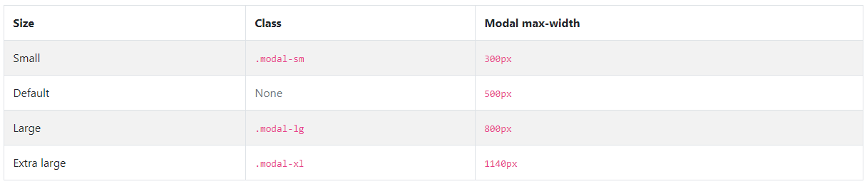
아래 class를 위 테이블 중 원하는 클래스로 변경하면 크기를 작게/크게 조절 가능하다.
<div class="modal-dialog">
- modal-sm
- modal-lg
- modal-xl
'웹관련프로그래밍(web programming) > Bootstrap(부트스트랩)' 카테고리의 다른 글
| HTML - Bootstrap 사용해서 공간(레이아웃) 배치하기 (Grid) (0) | 2021.10.13 |
|---|---|
| HTML - Bootstrap 사용해서 공간(레이아웃) 배치하기 (Container) (0) | 2021.10.11 |
| 부트스트랩 - 말풍선(Tooltip) 만들기 (예제로 쉽게 이해하기) (0) | 2021.10.08 |
| Bootstrap(부트스트랩)예제 가져와서 Visual Studio에서 실행하고 웹브라우져에서 확인하기(browser) (0) | 2021.07.16 |
| 부트스트랩 Margin vs Padding 배치 방법, 예제 (0) | 2021.02.10 |