해당 코드는 아래 참조 링크에서 가져왔다.
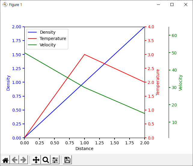
아래는 코드, 코드 해석, 결과 화면이다.
import matplotlib.pyplot as plt


def make_patch_spines_invisible(ax):
    ax.set_frame_on(True)
    ax.patch.set_visible(False)
    for sp in ax.spines.values():
        sp.set_visible(False)


fig, host = plt.subplots()
fig.subplots_adjust(right=0.75)

par1 = host.twinx()
par2 = host.twinx()

# Offset the right spine of par2.  The ticks and label have already been
# placed on the right by twinx above.
par2.spines["right"].set_position(("axes", 1.2))
# Having been created by twinx, par2 has its frame off, so the line of its
# detached spine is invisible.  First, activate the frame but make the patch
# and spines invisible.
make_patch_spines_invisible(par2)
# Second, show the right spine.
par2.spines["right"].set_visible(True)

p1, = host.plot([0, 1, 2], [0, 1, 2], "b-", label="Density")
p2, = par1.plot([0, 1, 2], [0, 3, 2], "r-", label="Temperature")
p3, = par2.plot([0, 1, 2], [50, 30, 15], "g-", label="Velocity")

host.set_xlim(0, 2)
host.set_ylim(0, 2)
par1.set_ylim(0, 4)
par2.set_ylim(1, 65)

host.set_xlabel("Distance")
host.set_ylabel("Density")
par1.set_ylabel("Temperature")
par2.set_ylabel("Velocity")

host.yaxis.label.set_color(p1.get_color())
par1.yaxis.label.set_color(p2.get_color())
par2.yaxis.label.set_color(p3.get_color())

tkw = dict(size=4, width=1.5)
host.tick_params(axis='y', colors=p1.get_color(), **tkw)
par1.tick_params(axis='y', colors=p2.get_color(), **tkw)
par2.tick_params(axis='y', colors=p3.get_color(), **tkw)
host.tick_params(axis='x', **tkw)

lines = [p1, p2, p3]

host.legend(lines, [l.get_label() for l in lines])

plt.show()
<결과 화면>
<코드 설명>
fig, host = plt.subplots() 에서 subplots은 여러개의 plot을 만들때 사용한다. return 값은 figure 와 axes 가 들어 간다.
host에는 axes 값이 들어 갔으니 host를 이용해서 여러 axes를 만든다.
twinx는 x축을 공유하면서 y축을 새로 만들어 준다. 자동으로 y축이 하나 있으니 twinx를 통해서 y축을 2개 더 만들었다.
자동으로 만들어진 축은 host에 들어 있다.
par2.spines["right"].set_position(("axes", 1.2)) 에는 velocity 축이 들어가는데 오른쪽에 배치하고 기존 그래프에서 1.2 정도 떨어뜨려서 배치 한것이다.
make_patch_spines_invisible(par2), par2.spines["right"].set_visible(True) 는 twinx에 의해 만들어진 par2 axes를 수정한 뒤 안보이게 만들었다가 다시 보이게 만들어서 activate 해줘야 한다는 의미인데 안해도 상관없는 듯하다.
plot, set_xlim, set_xlabel 각 축을 앞의 함수들로 이름, 값, 범위를 설정해주었다.
tkw = dict(size=4, width=1.5) 는 tkw에 dictionary로 키 값을 size, width로 넣고 value는 4, 1.5를 넣은 것이다.
host.tick_params(axis='y', colors=p1.get_color(), **tkw) 는 tick(눈금)의 설정하는 것인데 get_color는 앞에서 plot에서 설정한 색깔을 가져오는 것이다. **tkw는 키값과 argument를 받아서 tick_params에 넣은 것이다.
host.legend(lines, [l.get_label() for l in lines]) 를 사용해서 결과의 왼쪽 상단처럼 각 선에 대한 설명 문구를 넣어준다.
참조 : matplotlib.org/3.3.3/api/_as_gen/matplotlib.pyplot.subplots.html
matplotlib.pyplot.subplots — Matplotlib 3.3.3 documentation
Parameters: nrows, ncolsint, default: 1Number of rows/columns of the subplot grid. sharex, shareybool or {'none', 'all', 'row', 'col'}, default: FalseControls sharing of properties among x (sharex) or y (sharey) axes: True or 'all': x- or y-axis will be sh
matplotlib.org
'파이썬(Python) > matplotlib' 카테고리의 다른 글
| [Python]Matplotlib 그래프 그리기 팁(사이즈, subplot, 주석 (0) | 2022.03.04 |
|---|---|
| [Python, matplotlib] 선 스타일, 선 색상, 선 두께 (0) | 2021.10.17 |
| [Python, matplotlib] 여러 그래프에 한 화면에 그리기 (subplot) (0) | 2021.10.16 |
| [Python, matplotlib] 그래프에 Grid 그리기 예제 (옵션사용) (0) | 2021.10.15 |
| graph내에 event 처리 방법 - 마우스 클릭, 롤오버 (0) | 2020.11.20 |